2019
a didactic experience guiding you to discover your hero’s journey
Didactic playground experience, visual art, interactive digital tools & ludic spaces for an alternative school that believes each child will find a calling to change the world.
Project Type
Finished — Environmental experience design, Didactic tools, and signaling copywriting & design
Company — Client
By: EÑE —
For: Acton Academy Guatemala
Overview
When an international chain of alternative schools around the world takes its little Guatemalan counterpart as their role model, you know that they have something that stands out. And that is vision, a vision to empower kids and young adults to take ownership of their education by enhancing their curiosity and love of learning, giving them the tools to discover their unique gifts along with the dedication it takes to develop excellence.
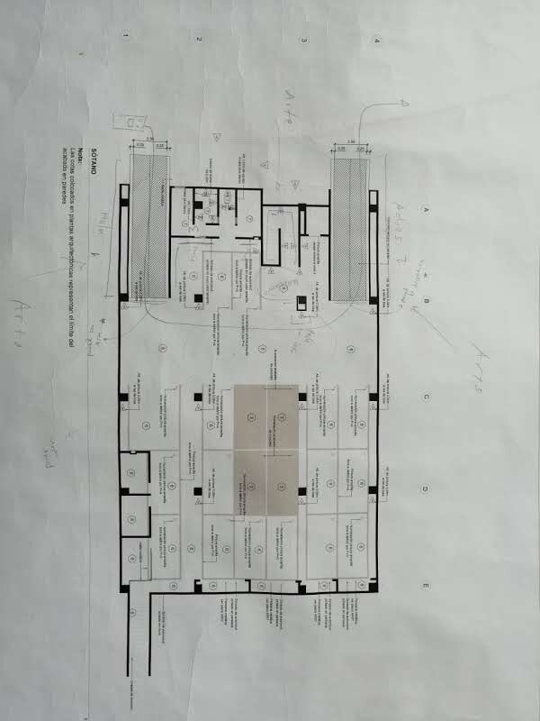
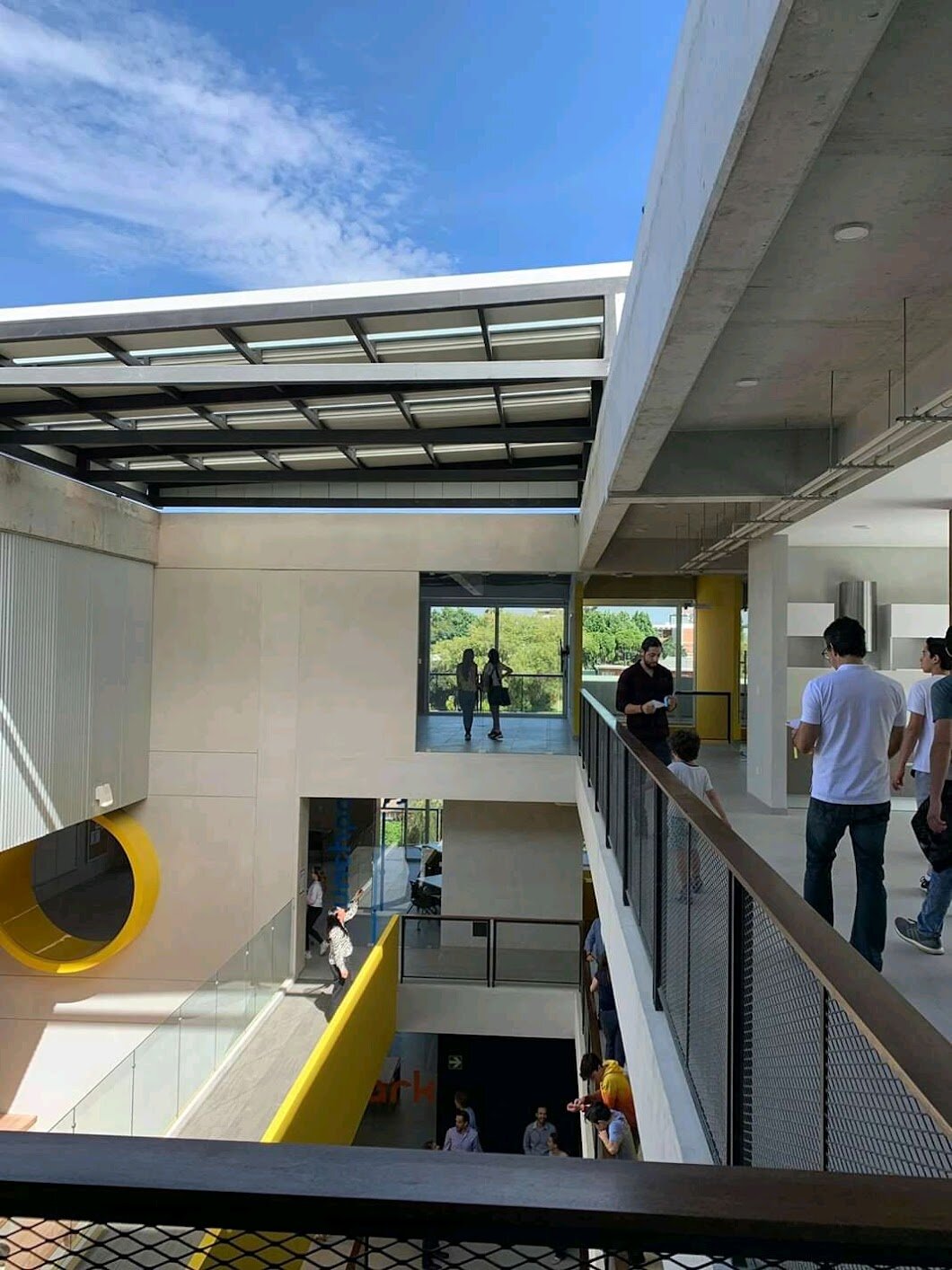
When the school migrated to a new campus designed by the magnific architecture studio Paredes- Aleman one would’ve thought there was nothing missing. But the truth is, a beautiful building doesn’t necessarily create a learning experience. To fulfill Acton’s promise of experiencing the wonders of the physical world, and the mysteries of life, we had to turn a lifeless building into a didactic playground and we did so with art, text, and physical and digital interactions.
Role
UX & Environmental design and Research Lead
Brand identity, Marketing strategy, user research & personas, information architecture, wireframing & flows, visual design, and prototyping.
Team
3 supervisors and 8 teammates
Team of 2 architects, 2 civil engineers, and 4 special education teachers.
“Our mission is to inspire each child who enters our doors to develop a calling that will change the world”
¿so what was the original problem?
The significant reasons for the failure of the traditional education system can be summarized in 8 flaws. First, poor learning outcome sets because of lack of focus and commitment; second, low teacher-student involvement because of the higher crowd ratios; third, the assumption that every kid has to have the same learning pathway and level; fourth, there is a lack of hands-on and skill-based learning; fifth, there is a bias towards rote learning rather than practical, creative skills and critical-thinking, sixth, there is a shortage of quality, committed teachers; and seventh, the students are never shown the purpose and meaning of their learning.
how did Acton address it?
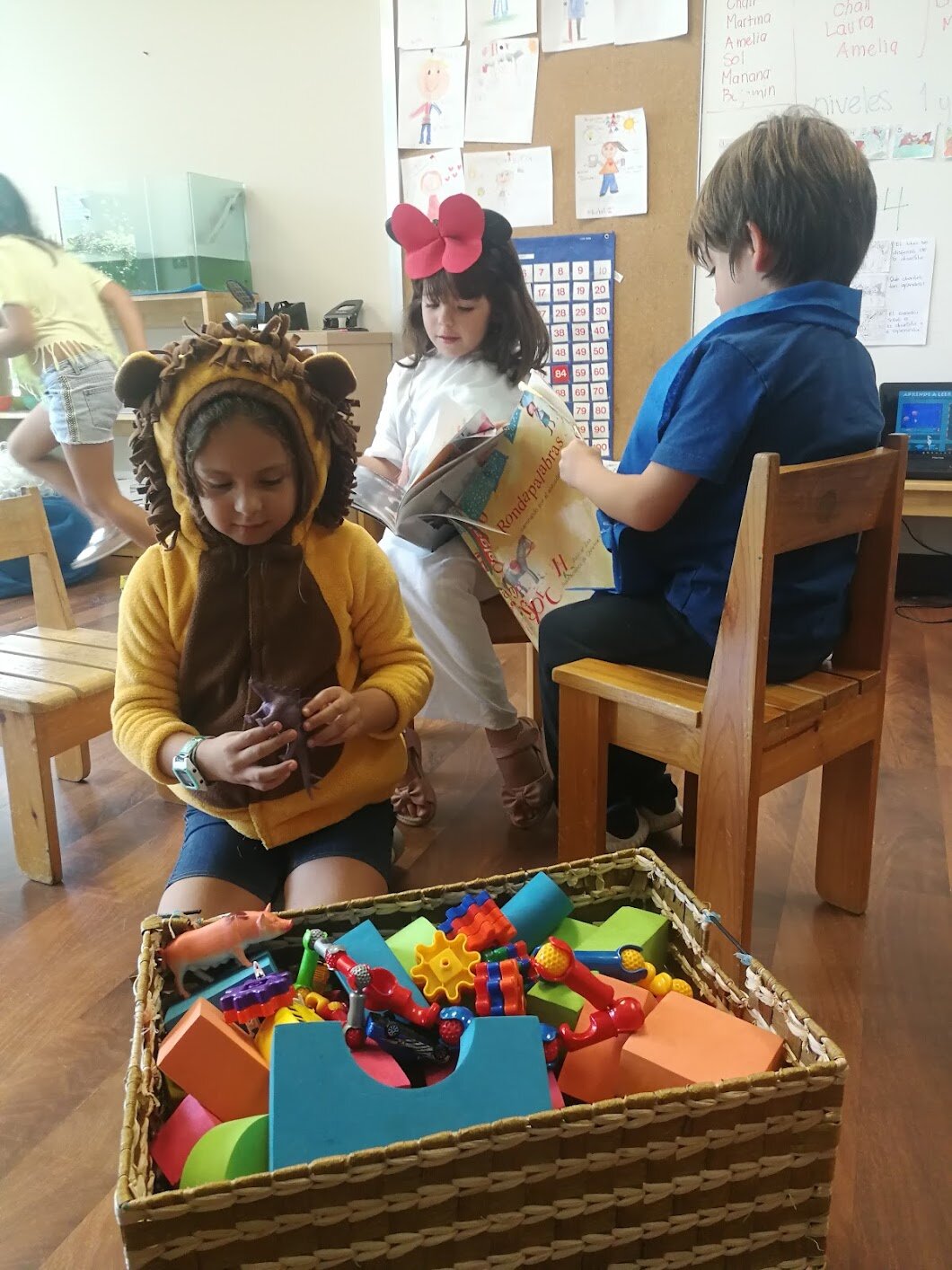
Creating a micro-school and learning community where children are on their Hero's Journey and are truly discovering who they are, what interests they have, and what unique talents they bring to the world. Guides or mentors accompany them on this learning journey, but they direct and manage themselves. On this path, they acquire knowledge and discover themselves. We refer to them as learners or Heroes. We remove the student concept because the goal is to empower them on this learning path. And this is one of the ways to do it.
The role of a guide is created, a guide who is there specifically to accompany them but allowing children to manage themselves so that they achieve the processes of reflection and self-knowledge. Our learners finally discover that they can acquire the knowledge they decide they need and get answers to whatever questions. They don't need an adult telling them "no," but rather, they can do it themselves. In Acton, all work is done inside the school; therefore, there are no exams and no homework because children work so much here. They have the afternoon free for themselves to explore their interests.
and what was the current challenge?
When the school migrated to a new campus designed by the magnific architecture studio Paredes- Aleman one would’ve thought there was nothing missing. But the truth is, a beautiful building doesn’t necessarily create a learning experience. To fulfill Acton’s promise of experiencing the wonders of the physical world, and the mysteries of life, we had to turn a lifeless building into a didactic playground, a true disruptive learning experience, from the physical objects of interaction, to the learner’s flow around the campus, to the digital tools that the student interacted with. We needed an omniconcept.
A HERO NEEDS A FIELD TO PLUNGE THROUGH
what about the user’s needs?
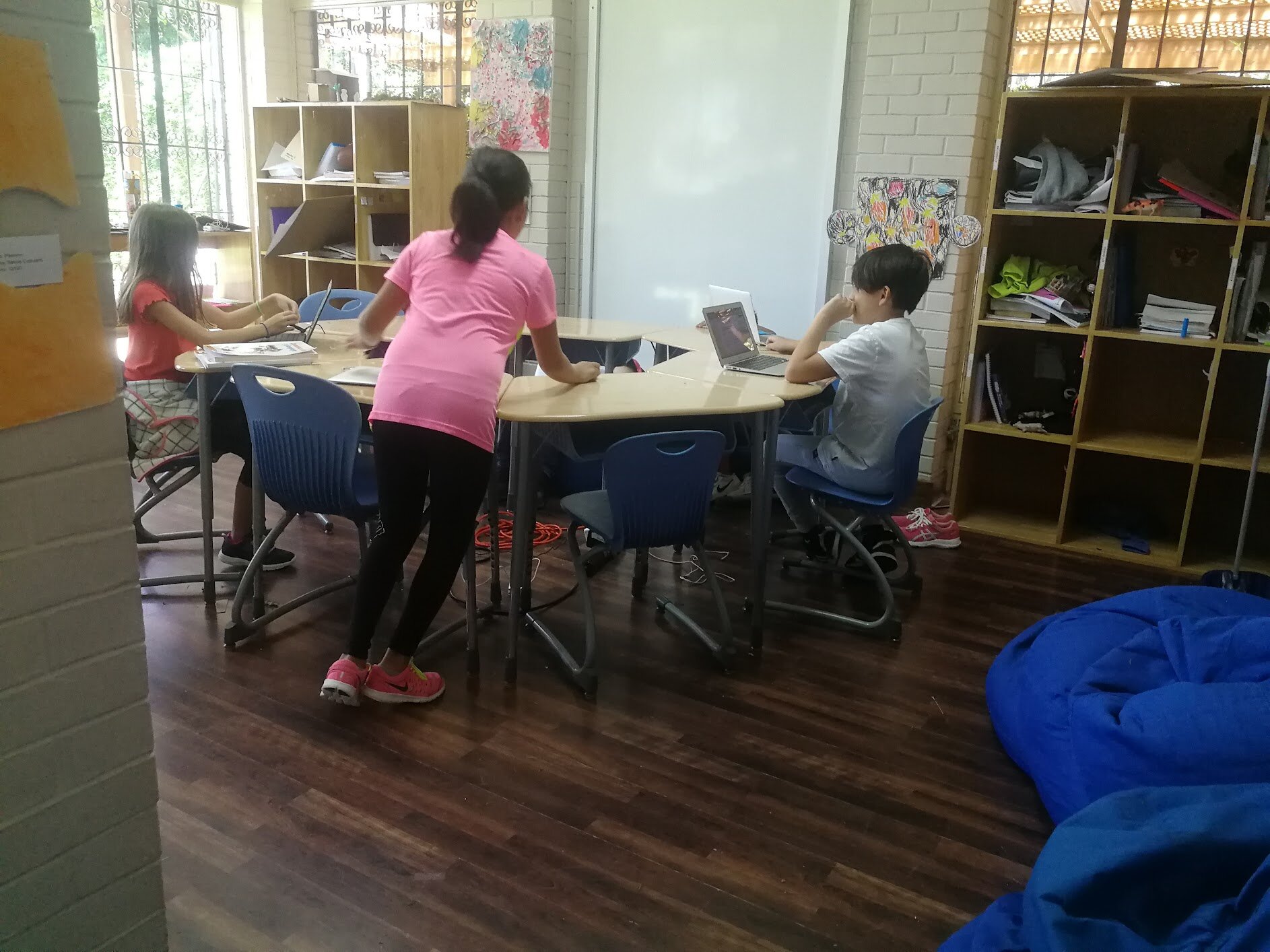
Once we’ve put the kid in the center of the experience, we found out that although they loved the school and the old campus, they felt like it no longer aroused the same excitement and curiosity that it once did. The space felt like a house, not a dungeon or a magical world that they could explore and feel challenged by. Everything, from the colors to the lighting, from the games to the written messages, from the available space to the furniture, everything had to make them feel like they were heroes about to quest into their learning journey, so the beautiful architectural sanctuary that the architects created wasn’t enough by itself to create that spirit.
Without the didactic elements, the beautiful architectural design felt like a museum or a sanctuary, not a learning playground.
— The Concept
The Solution!
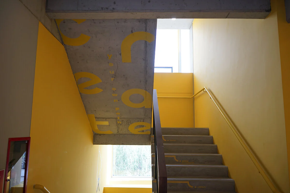
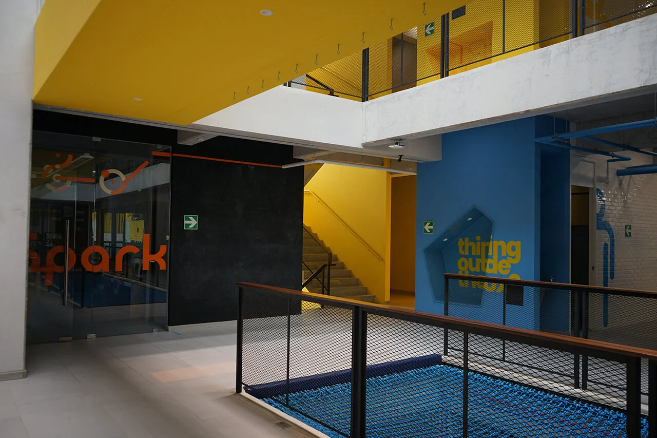
Didactic playground experience that uses visual art, mural copywriting, interactive digital & physical tools, and ludic spaces that together create an integrated environmental experience.
The school redesigned its campus and sought to fill it with messages and arts that challenged its students to find their hero’s journey and experience it fully.
Turning the conventional UX Principles now commonly used for digital and electronic products, to fit into a physical and learning product was one of the key challenges
The Process
“What are the similarities between user experience design and architectural design? Perhaps the best example can be found in the cross-appropriation of architectural and technological language in recent years. More and more often architects incorporate tech buzzwords like dynamic, hub, agile, incubator and scalable to communicate their intentions for contemporary design.”
